University Homepage
My Role
Senior UX Designer
Organization
The Ohio State University
Teammates
Diane Meves
Kelli Chesler
Corey Hinshaw
Jason Little
Summary
As the Senior UX Designer for The Ohio State University - University Marketing Department, I was responsible for cultivating the entire university's web presence. I partnered with department stakeholders, conducted user research, designed prototypes and collaborated with developers to deploy new technology and features to the university’s websites.
This case study will cover the process we took to refocus the website towards prospective students. You can the read the
University Site Features case study to find out more about the initiatives to enhance the on-site search functionality, and updating the interactive campus map.
Challenge
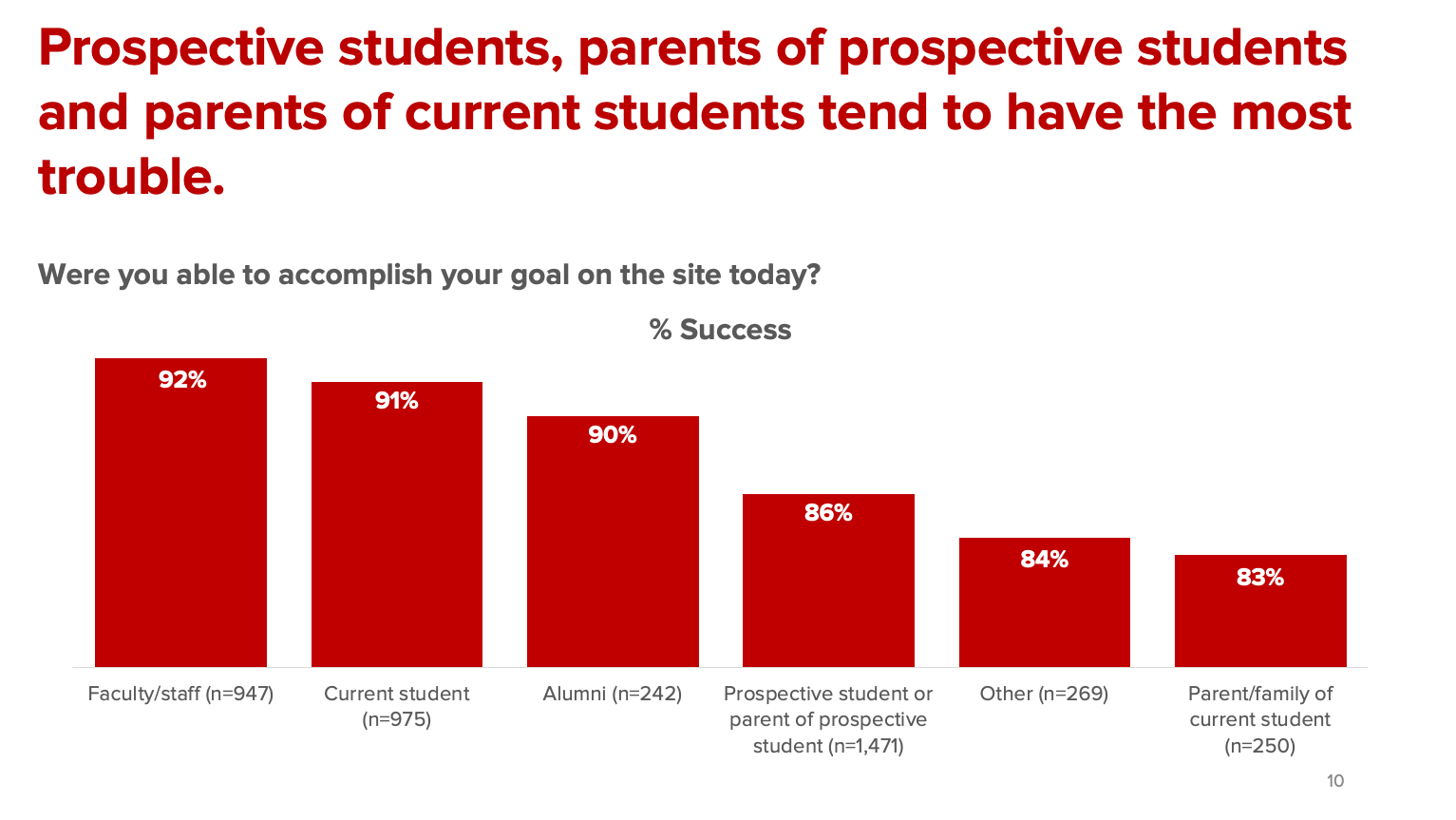
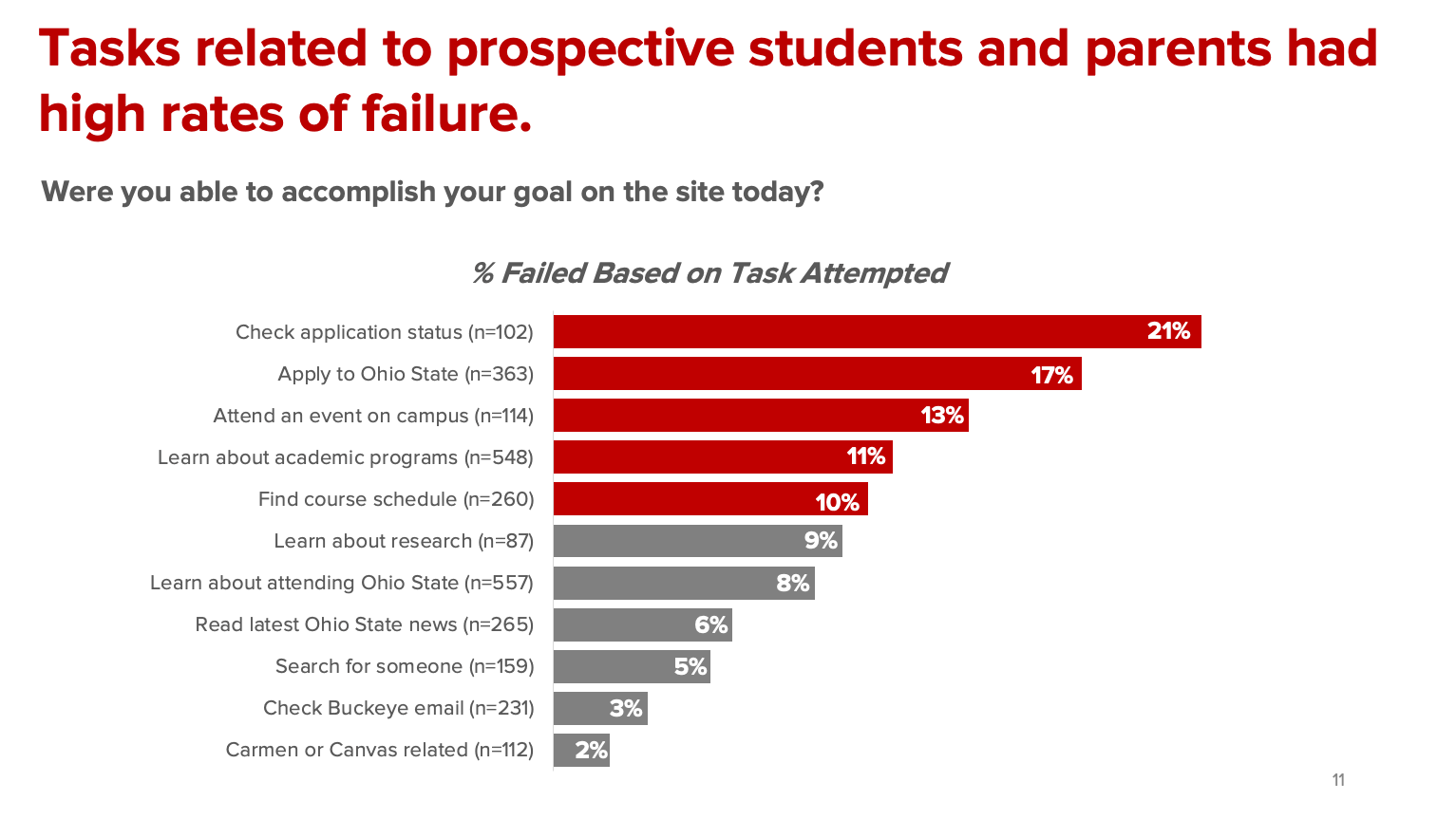
Research from different sources regarding the OSU homepage were indicating that the website was no longer serving its primary audience — potential students. The decision was made for my group to lead the efforts to reorient the page to this audience and set up metrics by which to measure success.
The opportunity to rework the OSU homepage was both exciting and daunting. Exciting because it was the digital front-door to the university and received around 7-million visitors annually. Daunting because university leadership and stakeholders were protective of the page and hesitant about making any changes. Continuous iteration and experimentation were not widely accepted ways of working and would need to be evangelized within the organization.
Discovery
Research
Research indicated that the OSU home page was not serving prospective student visitors successfully. Findings provided from a variety of sources spoke of prospective students having trouble finding what they need on the website. Sources included:
- Marketing & Insights - Qualtrics Satisfaction Study
- mStoner - Redesign Done Right Webinar
- SWOT analysis from the University Marketing team
- Arts & Sciences - Focus group
Recommendations
Armed with an idea of problems to solve, we set out to explore and test options that improve the OSU home page to better serve prospective students.
- Identity key areas to influence and change
- Leadership alignment and technology feasibility
- Prototype and test changes
- Review and analyze behaviors
Solutions
Key areas of the current home page were identified for improvement with design, content and navigation clarity.
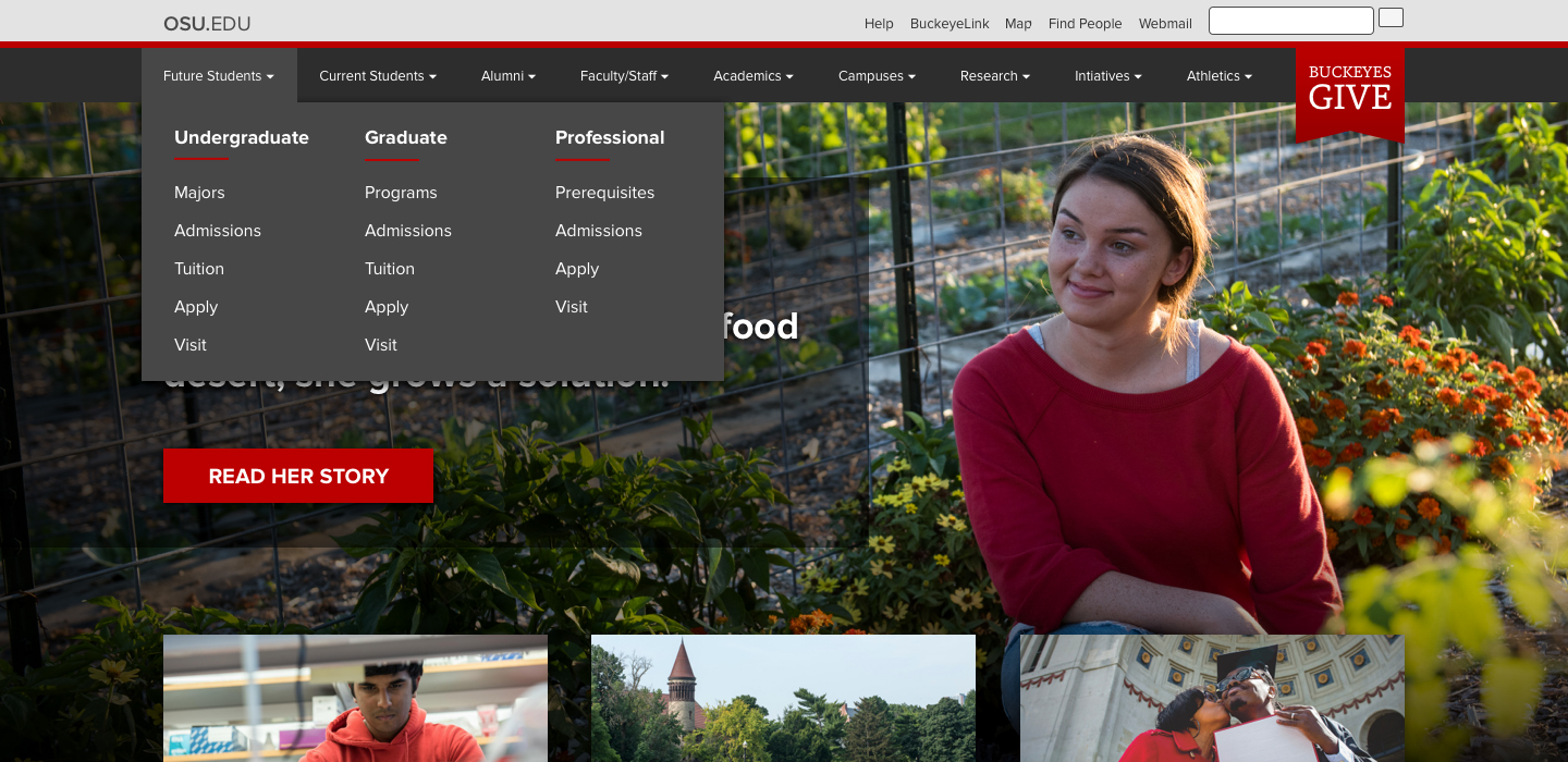
- Update primary navigation tab structure, including give ribbon
- Balance storytelling narrative with tactical student-centric needs
- Redesign marketing carousel for news/events on campus
- Prioritize content with a prospective student focus: Academic programs, career outcomes, campus visits, tuition costs and aide, student life, etc.
- Improve information architecture on secondary navigation, popular links, and footer
- Update social widgets
- Update design to support related native app ad banners
- Improve internal site search
The design team and I then decided to focus our initial solutions on the homepage content that was "above the fold". We hypothesized that university leadership would find the small incremental changes easier to digest and help us introduce the concept of ongoing iterative changes as well.
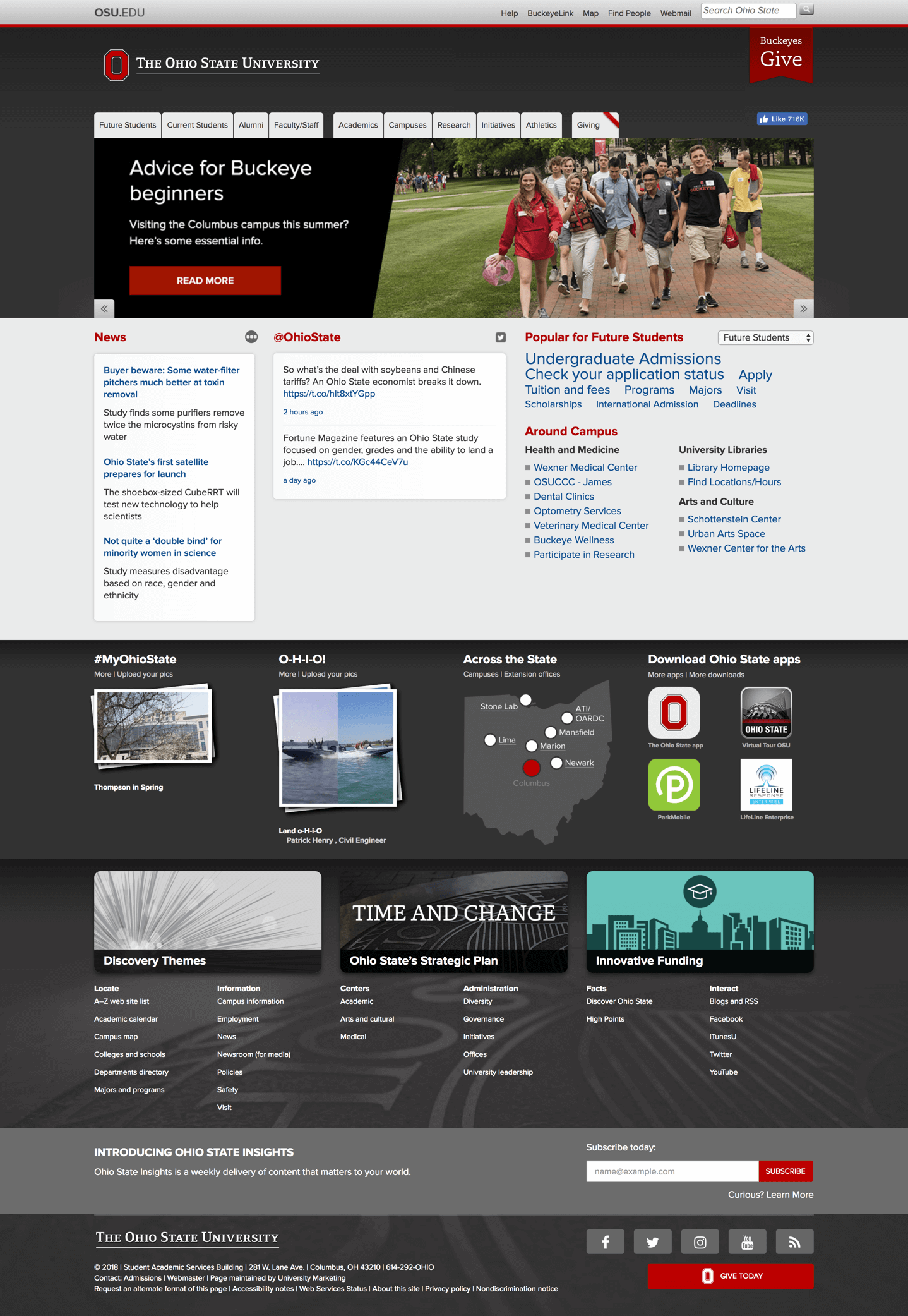
Old homepage design
Mockups
Several iterations of the design I proposed were circulated internally, and potential impacts to other groups were discussed. I worked with interdepartmental resources (writers, photographers, alumni magazine staff) to ensure content for the site could be produced in a manner that would compliment the proposed new layout.
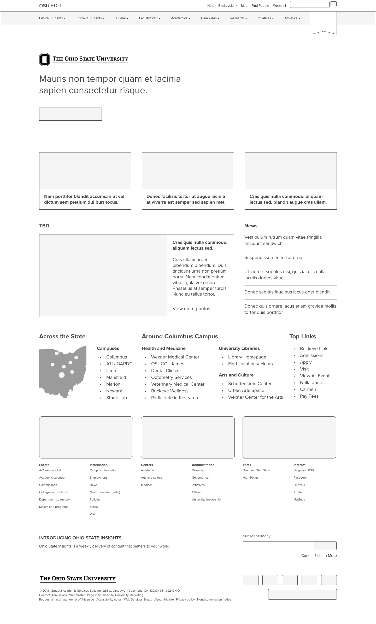
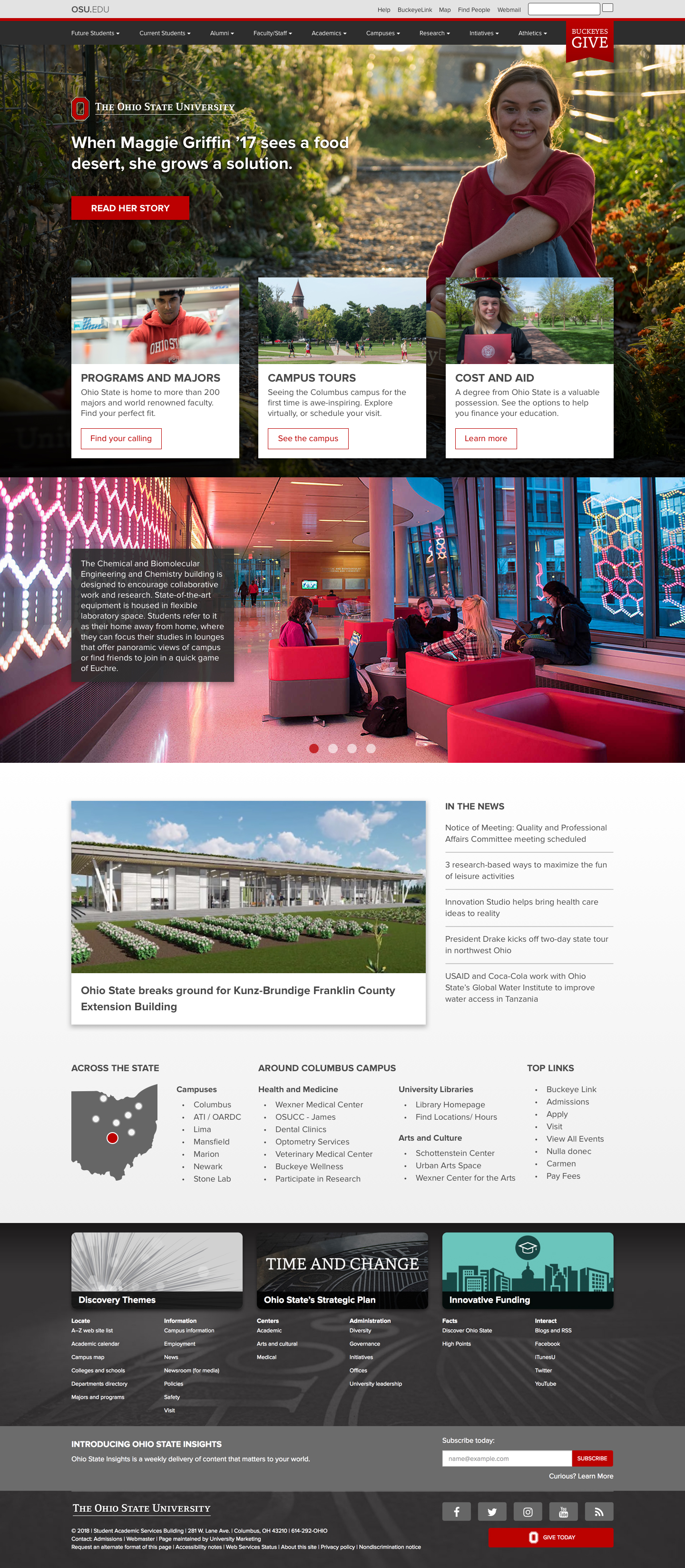
Changes to the homepage content included the following:
- Replaced the carousel with a single story to highlight. Worked with site content team to give favor to stories that were of interest to prospective students.
- Improve information architecture of in mega menu to more distinctly delineate the needs for prospective, current and alumni students.
- Creation of navigation cards that focus on the topics prospective students consider most when researching a university (majors, tuition, campus visits).
Testing
To measure the success of the new design I conducted intercept usability testing on campus during new student orientation week. Participants in the study were briefly qualified prior to testing and compensated at the conclusion of the session.
Participants were asked qualitative questions about the mockups and given tasks to perform while verbally thinking-aloud throughout the process. Participants actions were recorded and highlight videos for each of their tasks were created to be shared later with stakeholders across the university.
- Provide first impressions of the current homepage: Video
- Feedback regarding the carousel: Video
- Locate majors and course information using the site navigation: Video
- Locate information about tuition cost and financial aid: Video
- Schedule a campus tour: Video
- Provide first impressions of the proposed new homepage: Video
Testing participants preferred the new site design almost unanimously and found tasks easier to complete. I composed
topline reports and presentations and prepared to “go on tour” as we jokingly called it — to drum up support from critical stakeholders across the organization.
Outcome
The team and I gave presentations to stakeholders and partners (either through direct meetings or larger departmental gatherings) throughout the university to share our findings. I was crucially focused on informing them of the research we had done that had led to our conclusions, as well as to evangelize an iterative and collaborative approach going forward. We wanted to partner with them, not be prescriptive in how they would work with us.
I continued to work with the development team, making refinements and creating media guidelines for art and media until my time with the university came to an end. Elements of the homepage have since launched and I notice refinements have been continuous. I am hopeful this is indicative that the collaborative approach we established is still successful to this day.