University Site Features

My Role

Senior UX Designer

Organization

The Ohio State University

Teammates

Diane Meves
Kelli Chesler
Corey Hinshaw
Jason Little

Summary

During my tenure as Senior UX Designer for The Ohio State University - University Marketing Department I was responsible for cultivating the entire university's web presence. I partnered with department stakeholders, conducted user research, designed prototypes and collaborated with developers to deploy new technology or features to the university’s websites.

This case study will include two sections: enhancing the on-site search functionality, and updating the interactive campus map. You can read the University Homepage case study to learn more about the process we took to refocus the website towards prospective students.

Project: Site Search

The Ohio State University has over 60,000 students enrolled every year. As such their website is massive; thousands of pages for hundreds of groups and departments — all of whom are looking to accomplish different goals. Because of the sprawling nature of the site, finding content can be difficult. From the site analytics I could see that most traffic was a result of organic search results arriving directly to their relevant page. Another large percentage of visitors were using the site search function; I proposed doing some discovery work to see if we could make searching within the site more useful.

Discovery

Below are excerpts from a strategy document that I composed to collect my observations, research and questions. I used these notes to guide my decision making for solutions and also as a way to align stakeholders to the endeavor.

Observations

  • Search results for the most popular queries (scholarship, tuition, minors, application, etc) are relevant; but some of those pages can be excessively lengthy.
  • The site search uses Google custom search API. We can not see how it creates results for queries -- nor influence them. However, we can add content to appear alongside the search results.
  • For certain queries we display model results above the organic results in a visually identical manner. From a user's perspective this can be strange as the same result can appear twice with no visual delineation between them.
  • Unnatural language in search results title: “Your results for ‘academic%20calendar’”

Opportunities

  • Provide additional functionality/information that a 3rd party search platform could not reproduce.
  • Provide additional ancillary information alongside relevant results.
  • Since a large percentage of users utilize the site search, it is an opportunity to present promoted content that is relevant to their query.

Best practice research

  • NN/g: Navigation serves important functions: it shows people what they can find on the site and teaches them about the structure of the search space. Using the navigation categories is often faster and easier for users than generating a good search query. Plus, many times site search does not work well or requires users to have a good understanding of its limitations.
  • NN/g: Search is the user's lifeline for mastering complex websites. The best designs offer a simple search box on the homepage and play down advanced search and scoping.
  • NN/g: Most users are unable to solve even halfway complicated problems with search. Better to redirect their efforts into more supportive user interfaces when possible.
  • NN/g: Users increasingly rely on individual pages listed by search engines instead of finding better ways to tackle problems.

Questions

  • Do we want to evolve search into an answer engine (“how do I…”, “where can I…”) or just provide results to accompany basic search terms?
  • What percentage of users are turning to search due to failure to find appropriate content via presented navigational means?
  • How are users engaging with the search? Are they using natural language or basic search terms?
  • Are users satisfied with the results being presented to their query? What are we missing? How can we measure that?
  • How can we make it so people don’t have to use search? Can we just present the content that is relevant to the majority of users?

Solutions

Opportunity exists to delight users by providing enhanced contextually-relevant responses, alongside their expected (and accurate) search results. Google does this now with answering common questions or scraping content from a site directly.

Method

  • Provide query-relevant snippets of pages before search results. 
  • Display supportive ancillary information alongside promoted search results.
  • Reserve imagery accompanying results for promoted/featured links.
  • Provide related and trending search queries alongside results.
Screenshot of the flowchart for how information is displayed in the search results page. Screenshot mockup of search results page proposed changes

High-fidelity prototypes

Outcome

I socialized the prototypes with various departments within the university. I asked them to envision ways in which they could utilize this tool, and that my prototypes were merely a starting point to begin the conversation of where to go next. The project was launched with a selection of search terms featuring newly authored topic results. At the end of my time with the project I provided strategies to perform qualitative research to ensure the correct information was displayed in our new results sections.

Project: Campus Map

The university campus map was one of the most frequently visited pages on the OSU website, receiving on average 28k unique page views monthly. The backend was built using antiquated architecture and was slated to be updated by the development group. Seeing the opportunity to enhance this frequently used feature; myself and the rest of the UX team set about to understand the audiences using the campus map and what features they need/want. What follows are excerpts from the summary report I authored.

Discovery

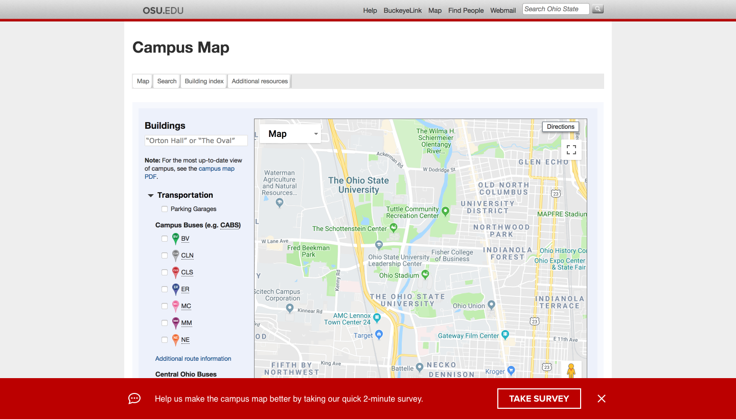
For just over one-week the campus map displayed a notification inviting visitors to complete a quick survey to help us improve the campus map experience.
Screenshot of a prompt for the user to take a survey on the campus map page
The survey itself was quite brief so as to gather as many responses as possible. We were interested in learning their association to the university (current student, prospective student, faculty, parent or other), what they were looking for and if they were successful in finding it. The final question was asking if they would be willing to have a brief conversation with a member of the UX team. The survey was hosted on Qualtrics and 69 responses were received.

Key findings

Of the 69 respondents they self-identified as the following:
  • 36 faculty or staff, 19 students, 4 prospective students, and 7 responded as "Other"
  • 67% of respondents answered they were able to find what they were looking for on the campus map.
  • Respondents indicated they were using the map for the following reasons: 27 for directions, 16 for building information, 13 for bus routes, 10 for parking information, and 6 for student services.

Interviews

One-on-one interviews were requested from 15 participants, 9 responded to an interview request with a scheduled time, 7 participated in the interview and were compensated with $10 in Starbuck gift cards. 5 interview subjects were staff, and 2 interview subjects were current students.

Interview goal:
  • Understand the current experience of users with the online maps feature on the OSU website.
  • Discover what information users of the online maps value or find important with the current version. What challenges exist with it?
  • What are users’ expectations of a campus map?
You can download samples of the completed questionnaires that I authored and completed during the interviews here and here.

Key findings:
  • 6 of 7 answered they use the web campus map exclusively on their laptop or desktop computers.
  • 3 of 7 answered they use the map daily, 2 of 7 use it weekly, and 2 of 7 use the map on a monthly basis.
  • 6 of 7 answered they know of and/or use the mobile app.
  • 3 of 7 answered they prefer using the mobile phone application for mapping activities. This includes both students interviewed.
  • 5 of 5 staff interviewed indicate they rely upon the campus map to perform job duties.
  • 4 of 7 indicated that one of the first activities they do on the map is zoom in on the building they searched for. 2 of those mentioned the frustration with the “Ctrl + Scroll” message to zoom.
  • 3 of 7 answered they arrived at the campus map after doing a Google search for a specific building, clicking the results bringing them to the osu.edu/map/building page, then clicking the “view on map” link to see its location on a map.
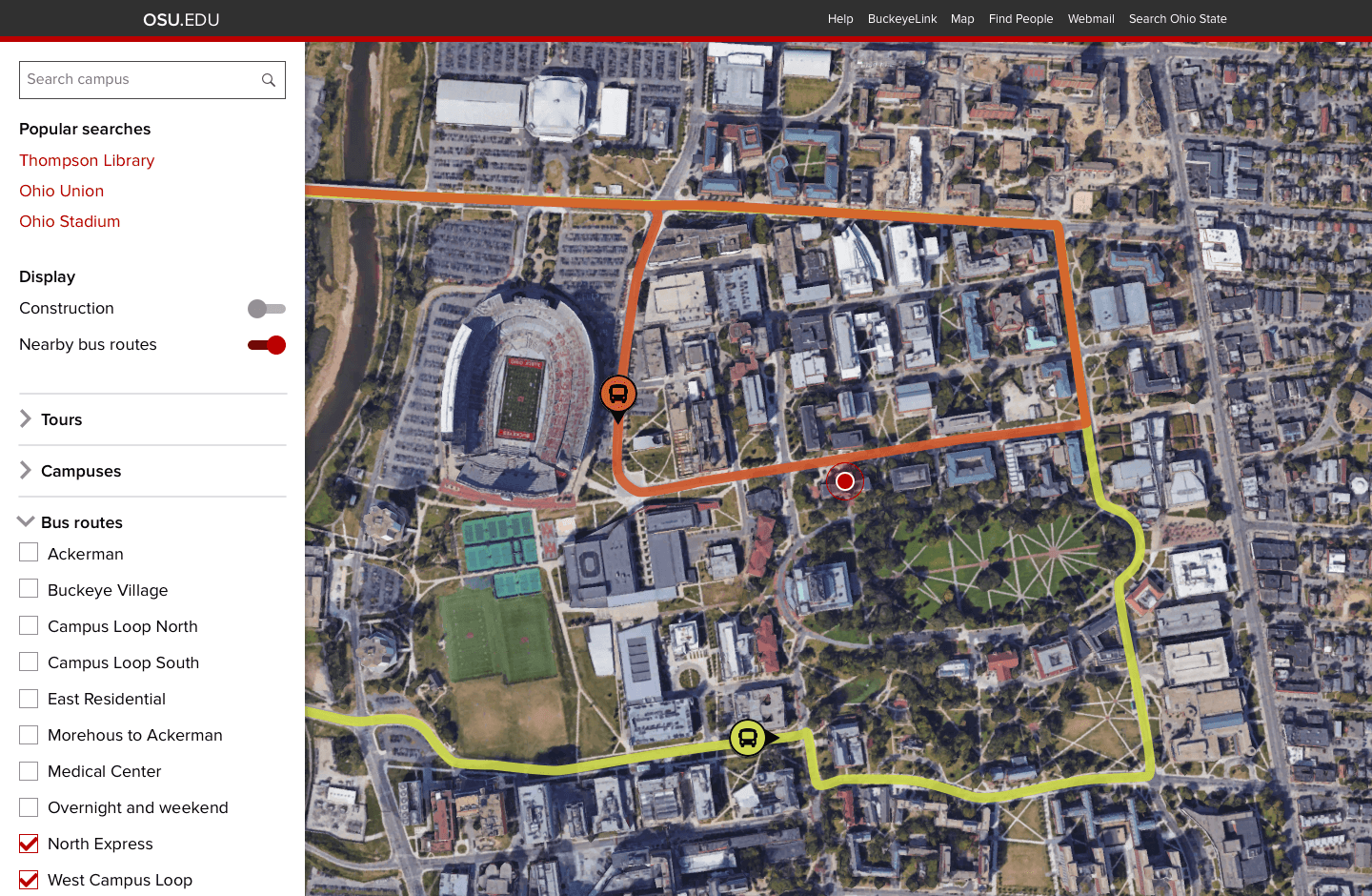
  • 3 of 7 answered they thought a bus routing/scheduling feature on the campus map would be helpful. It exists but they could not find it or did not know about it.
  • 2 of 7 answered they were unable to find buildings on the map that are a part of either the main or regional campuses.
  • 2 of 2 students answered they use the OSU mobile app daily for parking and bus scheduling information.
  • 1 respondent who was partially physically handicapped indicated the map could feature more accessibility information for buildings. They also mentioned information on the entrance locations for each building would be helpful for them to plan their day.

Solutions

Based upon key findings from both the survey and user interviews I sent the following recommendations up through leadership to go through a change-management workflow.
  • Conduct an audit on buildings represented on the map to ensure they are represented and the content is accurate.
  • Focus on desktop experience for desktop map, encourage users to utilize the app for mobile experience (The app was managed by a different department).
  • By default, start the map zoomed in on the user’s location, as well as the location of their search query. If possible remove the need for “ctrl + scroll” to zoom.
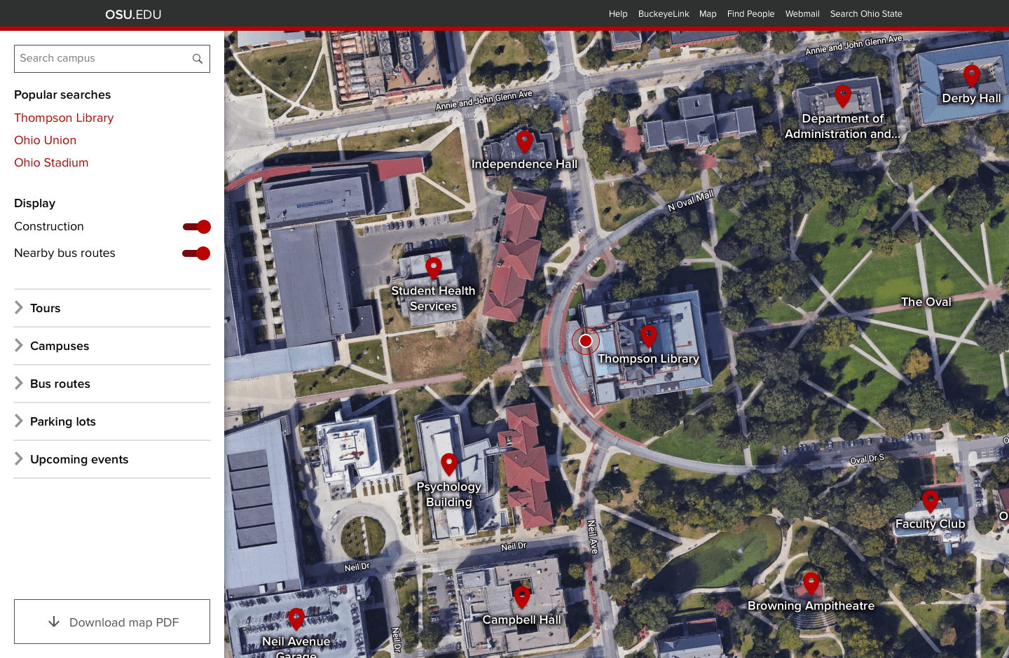
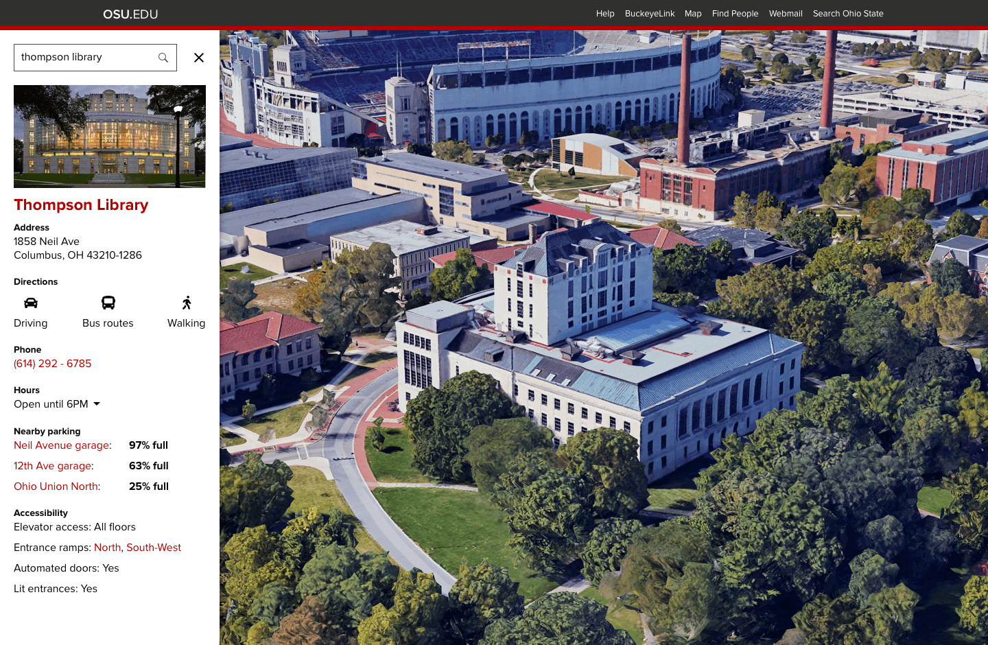
  • Display important building information such as hours, accessibility accommodations and entrance locations, nearby parking, parking capacity and directions (walking, driving, and nearby bus routes) at the map view.
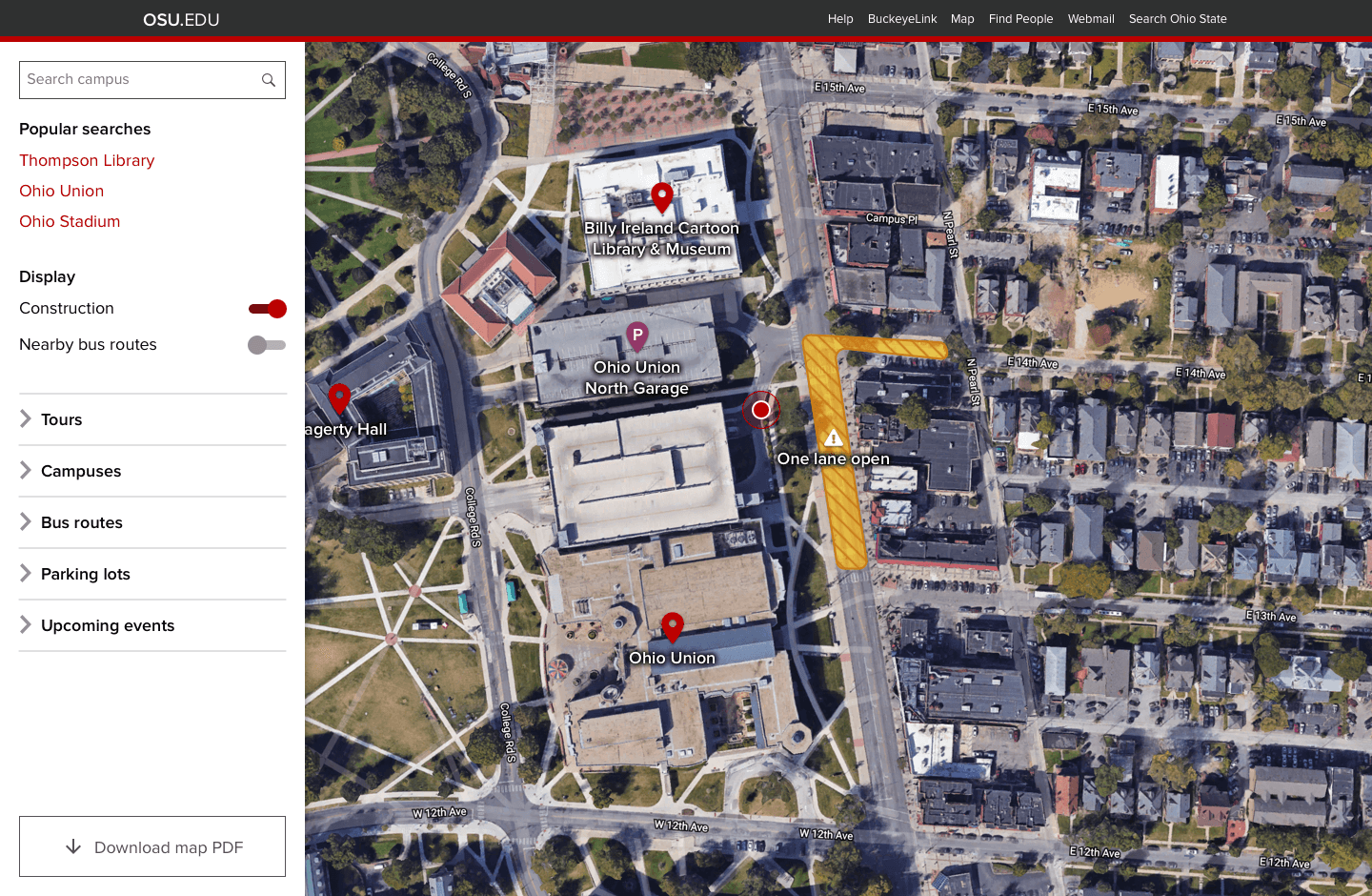
  • Display bus routes and construction information by default in map view.
  • Include an option to display upcoming event locations and information.
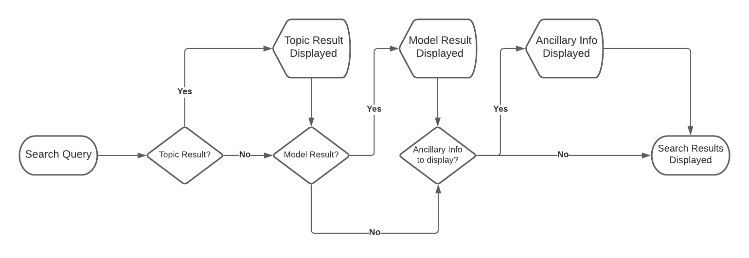
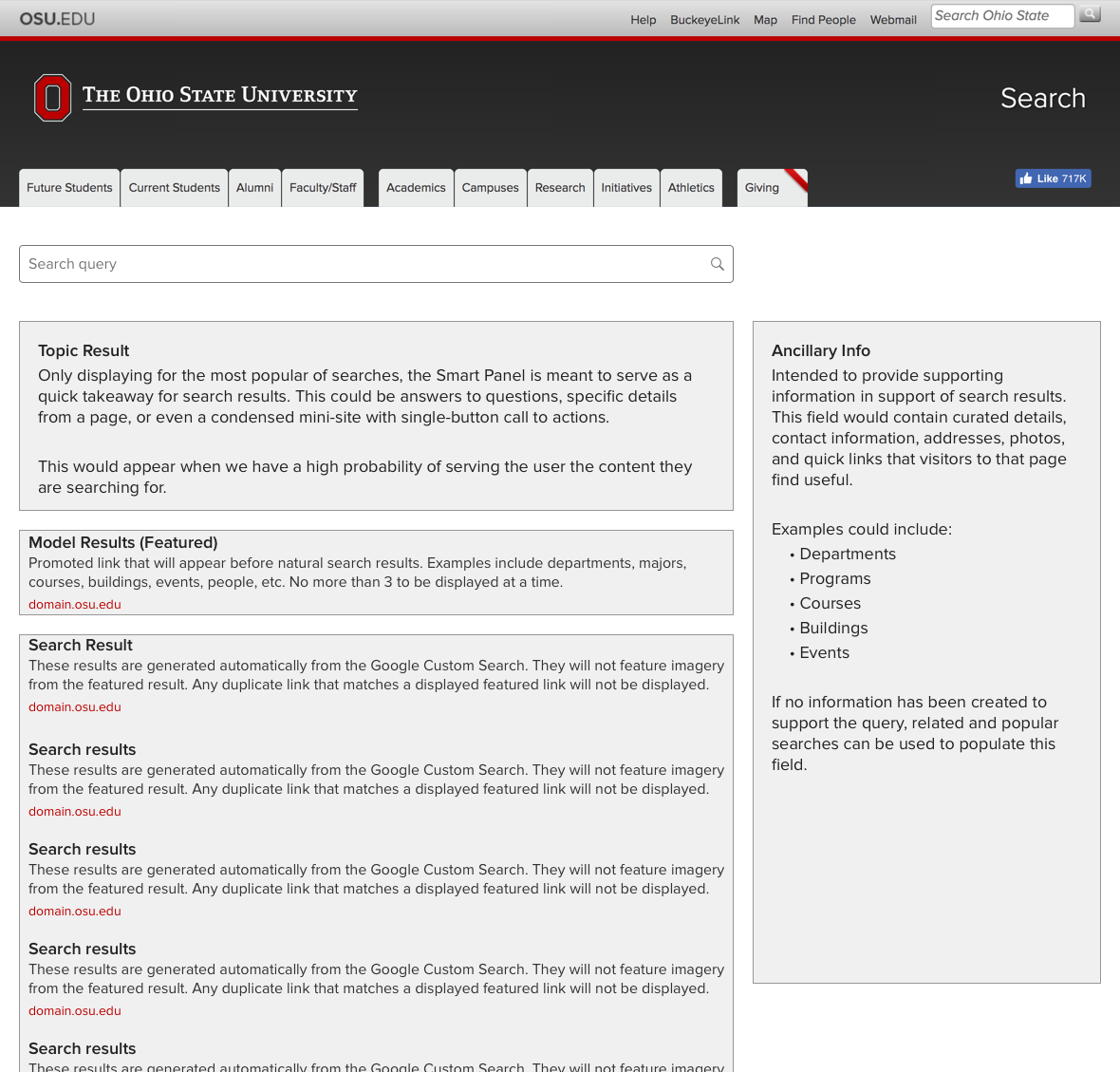
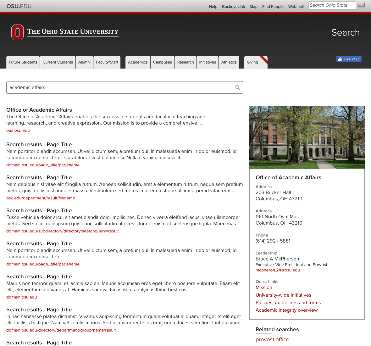
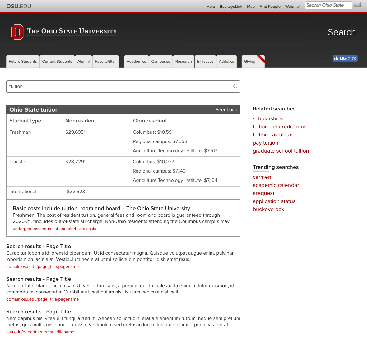
After the survey was concluded I was asked by the development team to conceptualize what a modern university campus map experience could look like. It was a fun exercise as I was not given any technical restrictions and to look for opportunities that could set this map apart from third party applications like Google or Apple Maps.

Outcome

I had moved on from the university before I could see the reimagined campus map come to fruition. I included this project in my university case study as an example of a research initiative with multiple information gathering methodologies and actionable takeaways.